Search this keyword

Wednesday, April 15, 2015

Where You Dream

We Americans have certainly fluffed our nests. We have layered our Simons mattresses with high-count sheets, cashmere blankets, down comforters, mohair throws, feather pillows and more pillows. Before we pull back the covers at bedtime, we must offload the stuff-ing. So, why do we dress our beds to the nines?
The short answer is Madison Avenue. We have been conditioned by advertising to picture a bed with piles of pillows and several layers of bedclothes. Artistically, the layers add visual interest to a bedroom, bringing color and pattern to an otherwise large plain surface.
Let's analyze the bed displays found at Nell Hill's, the Kansas City shop I wrote about in my last post. Most of the beds in the store, have a dramatic backdrop. In the picture below, a folding screen sits behind the bed, telescoping our focus from the larger wall to a narrower perimeter. The slats provide texture.
Next, in front of the screen is a headboard. Fabric covered headboards are currently very popular. On this charcoal headboard above, nickel tacks outline the frame, taking our eye in further towards the center of the bed. In front of the headboard, four rows of pillows stand in attention.

The bed below illustrates the pillow sizes.  The back row, closest to the headboard, are European-sized pillows. Because they are taller than standard pillows, they are perfect for the back row. Next, a pillow several inches shorter than the Euro pillow permits the back pillow to be visible. In front, of that pillow is a standard pillow. (Choose a standard, queen, or king width depending on your bed.) Finally, front and center is the narrowest pillow or pillows. For this row, you can use two boudoir pillows or a custom made long pillow to bridge the others.
Here is a diagram of pillow sizes.

http://cdn.shopify.com
Underneath the pillows, the sheets, the blanket, and a throw are visible. Properly, the mattress pad is covered with a fitted sheet, and then top sheet pulled up enough so it can lap over the blanket, coverlet or bedspread.

Next, the duvet is folded in half and covers the lower third of the bed. Often a smaller throw is tossed across the bed or left on the bench at the foot of the bed.

Finally, beneath the mattress covering the space to the floor is a dust ruffle.
Studying these displays, a bench, a love-seat, or a blanket chest often sits at the end of the bed and a chandelier usually hangs over top.


I must confess, I have been influenced by advertising, but haven't succumbed completely. I put pillows at the top of our bed, a feather duvet at the foot of the bed, and a dust ruffle that touches the floor. However, I have "cheaped-out" on the number of pillows and don't have a cashmere throw. What about you?  Have you been conditioned to feather your nest like the beds shown here?

Monday, April 6, 2015

You Are Welcome to Come Shopping

When I visit my daughter in Kansas City, we often make a journey north of town to Briarcliff Village to shop at Nell Hill's, an over-the-top home furnishing store. I'd like to invite you to join us on a shopping trip for some inspiration to use in your home.

We won't be alone on this jaunt. Every time we go, the Kansas City store is bustling. Purportedly, over 75,000 customers visit the mother-store in Atchison, Kansas annually. In fact, an estimated ninety-five percent of customers travel more than 75 miles several times a year for home design inspiration at Nell Hill's.

The secret of the loyal customers is always-changing, artistically-curated merchandise displayed in homelike vignettes at reasonable prices.  No wonder the owner, Mary Carol Garrity, has been featured on NBC'S Today and CBS' The Early Show, and has been dubbed by Forbes magazine "one of the hottest little retailers" in the country.
Let's join the trail of women who have found this store and see why they come back again and again.

First, the merchandise is always fresh, never stale. The staff changes every vignette in every room every couple of months. Even the walls are repainted current shades of Garrity's specially tinted paints! New ideas for every season keep customers coming back.

Below is an example of this season's palate. Doesn't this vignette look like spring heading towards summer?

The second reason for Nell Hill's popularity is the artistic displays. Gallery walls are eye-catching, balanced, and unusual.
I would never have thought of placing a large silver platter in a gallery wall of sketches, but it looks fabulous.
Garrity's artistically arranged tabletops also teach lessons in accessorizing. In the display below, notice the unifying role blue plays, and how varying sizes and shapes contribute interest. The balance of pairs also makes this arrangement pleasing. There are three singles thrown in to keep the eye from being bored. Can you find them? Finally, observe how books used as stands vary heights and keep the whole vignette anything but static.

The store has certainly drawn my daughter and me back more than once. Why? As I analyze, I believe a third reason is because the room displays are full of pretty accessories and comfortable, well-made furniture--all for sale--and all shown in home-like settings.  Even the elevator is inviting!

Garrity is a wise retailer. She displays items so customers can picture how to use them. Many people have trouble picturing a sofa or pair of chairs in their home. However, once they see the piece or pieces in relation to similarly-scaled furniture, they can mentally transport it to their space.
Seeing color and pattern combinations in mini-rooms also gives customers ideas. Study the four patterns below to see why they work together. The orange wingback chair takes the uncontested lead, because of the loud color and tone-on-tone pattern which reads as a solid. Next in scale is the boldly-striped sofa, followed by the pillow's trellis motif. Finally, the small Greek-key pattern on the ottoman makes a pleasing companion, not attracting attention away from any other pattern. (Lesson: look at patterns together to be sure they vary in scale, so none compete for dominance.)

Besides the always-fresh, artistic, homey settings, a fourth reason customers shop at Nell Hill's is the quantity and variety of merchandise offered at reasonable prices. Antiques are interspersed with new merchandise; all are fairly priced. (In the photo above, the silver service is vintage, and Chinese bowl is antique--all priced to sell.)

Garrity is able to beat the competition's prices for new merchandise by ordering such a large volume. Even designers are among her repeat customers because--despite their discount--they cannot match the prices. In addition, twice-a-year sales attract customers who arrive pulling u-hauls.

Obviously, Mary Carol Garrity, the entrepreneur who built this franchise, is a one-woman merchandising dynamo. Her midwestern roots translate north to south, east to west. Fly-over country, it turns out, embodies a quality all Americans value--warm, genuine friendliness.

In fact, Nell Hill's was named after the owner's grandmother, an Irish immigrant to Kansas, who "made everyone who entered her home feel like the most special person on earth." No wonder shoppers visit and visit again; we all want our homes to read like the store: "Welcome. I'm so glad you came".


Wednesday, March 11, 2015

So Long Winter; Welcome Puddle-Wonderful Spring

Last week, old man winter exhaled one last blast of Arctic air. He left behind about seven inches of cold on the ground as his exclamation point. This last gasp left me angry. How dare he chase away the robins I had seen just beginning to peak out from under their covers?


In defiance, I went to the sunroom and retired the chocolate-brown fur throws and snowmen pillows.
I replaced them with spring-green blankets.

Then I took my stand by placing primroses in the center of the dining-room table.


Next, I stored the porcelain snowballs that had been in the wire basket on my front porch just waiting for a fight, and replaced them with more congenial pansies.

Still not satisfied with my assault, I decided to make a spring-worthy wreathe in robin's egg blue.

I found instructions on line at: http://familycrafts.about.com/od/wreaths/ss/ribbonwreath_5.htm#step-heading. After making my supply list, I sloshed through slush to a local fabric outlet to purchase ribbon in various shades and widths of aqua, mint, and blue.

The wreathe instructions called for five yards of nine varieties of ribbon. The Pennsylvania Fabric Outlet, where I have purchased fabric for years is liquidating (sniff-sniff), but still had plain colored satin and grosgrain ribbon in a variety of widths and shades. I purchased about 30 yards of ribbon there, before snow-plowing over to AC Moore to buy the straw wreathe form and three other rolls of ribbon--one zigzag-striped, another polka dotted, and a third fuzzy rickrack.

The on-line instructions said anyone--children to adults--could make this wreathe in about an hour. It took me several hours. :) It wasn't hard, just time consuming.

First, you cut the ribbon into four inch lengths. Then beginning with one color of ribbon, you twirl it into a circle and pin it onto the straw form. I found it took two pins to hold each curl in place. Working with the first color of ribbon, you cover the wreath scattering the color evenly around the circle. Then you follow suit with each color. As you fill in the circle, the wreathe takes on a perky personality.

When I finished, I flung open the front door to hang my handiwork. Unhappily, a sharp blast of cold air took my breath away. However, the persistent old man isn't going to have the last word. His days are numbered.

Some day soon, I will be able to open the door and invite Spring inside. Until then, I will settle on this "mud-luscious", "puddle-wonderful" season.

[in Just-]

                               in Just- 
                               spring          when the world is mud- 
                               luscious the little 
                               lame balloonman 

                                whistles          far          and wee 

                                 and eddieandbill come 
                                 running from marbles and 
                                 piracies and it's 
                                 spring 

                                 when the world is puddle-wonderful 

                                  the queer 
                                  old balloonman whistles 
                                  far          and             wee 
                                  and bettyandisbel come dancing 

                                  from hop-scotch and jump-rope and 

                                  it's 
                                  spring 
                                  and 

                                        the 

                                               goat-footed 

                                    balloonMan          whistles 
                                    far 
                                    and 
                                    wee 


Wednesday, March 4, 2015

Celebrating a Life

I have been missing-in-action the past few weeks for good reason--a death in the family. My father-in-law passed away. He had been ill for a few years, so it was a long goodbye. He is now at home with his Savior.


As we planned his memorial service and arranged for friends and family from far and near to celebrate his life with us, I came to appreciate several aspects of our American-funeral-tradition.

First, funerals bring loved ones together. Why do we wait for a death to see cousins, aunts and uncles? We shouldn't, because these ties reinforce us when the winds-of-life bend us.  

Second, a memorial service is motivational. Reviewing my father-in-law's life spurred the rest of us on to copy his work-ethic, his love for the Bible, and his life investment in mentoring others. 

And last, Christian funeral services comfort our hearts as we are reassured that heaven awaits those who have accepted Christ's gift of forgiveness. 

In this vein, the poem by Emily Dickinson "The Bustle in a House" is memorable, because it captures the finality of death on earth, but the hope of reunion in eternity.
 
The Bustle in a House
Emily Dickinson

The bustle in a house
the morning after death
is solemnest of industries
enacted upon earth.

The sweeping up the heart
and putting love away
we shall not want to use again
until eternity.

Tuesday, February 10, 2015

Church Office Conversion

First, let me be clear. Conversion, in this post, does not refer to a rebel on his knees in a pastor's study opening his life to the Lord's dynamic intervention. Rather, this post is about a space conversion, the adaptation of a space for a different use. Stick with me and learn about: adaptive reuse.

Proclamation Presbyterian is a mission congregation of the Presbyterian Church in America.  Founding minister, Rev. Troy DeBruin, rented an office on Main Street in Mt Joy, Pennsylvania. This temporary space is close to the Church of God building where the fledgling congregation meets each Sunday evening at 5 p.m.

At the end of the summer, I undertook the challenge of helping the pastor turn an ugly, on-the-street office into an inviting, multi-use church base.


The new church headquarters is two rooms, a large outer room and an inner office. The outer, multipurpose room is about 13 by 30 feet, and the inner room is 16 by 19 feet. Both rooms have nine-foot ceilings.

Originally, the outer room walls were painted fatigue green and the woodwork bisque. Because we were working with a bare bones budget, I decided to change only the wall color and work with the  neutral woodwork. After all, this is rented--not permanent--space. In the fall, a group of volunteers came and helped us give the walls two coats of Benjamin Moore paint (linen white).


I purchased a comfortable sofa and chair covered in a soft, yet durable, wool and had floor-to-ceiling draperies constructed to warm up the huge room.

On the wall where a folding table served as a make-shift desk, we placed bookcases.


The ping-pong table which leaned against the opposite wall was adapted to become a conference table. 
                             
It was painted Benjamin Moore Roxbury caramel to match the draperies.When young people drop by, a net and paddles resurface, the conference room chairs are wheeled out the way, and the table can again see competition.

Meanwhile, at the other end of the main room, the young pastor has a stand-up desk where he can work when his desk chair gets uncomfortable.

 Hidden behind the stand-up desk is a microwave, mini-fridge, and coffee maker.

With the outer room ready for guests, the inner office needed to be refreshed. When the church first rented the space, the bare walls and temporary furniture made the room look makeshift.


However, a couple more gallons of linen white paint and two more sets of ceiling-to-floor draperies   transformed the space.
                             

Then, new-to-the-church desks and credenzas add professionalism to the office.


Now the space is being used by all ages--from tots enjoying daddy's computer, to teenagers playing pingpong, to adults at prayer.
This is what I call adaptive reuse!


Thursday, January 29, 2015

Facelift Takes Years Off a Bath

Before Christmas we decided to give our master bathroom a facelift, nothing major, just a nip and a tuck. The makeover began, as they all do, with the modest intention of a minimally invasive procedure: merely a paint job.

However, when I looked at the room with a critical eye, I had to admit the once-classic-beauty had the design-equivalent of drooping eyelids and a sagging jaw line. Now mind you, I did not want to spend the price of a real facelift :).  I just wanted to tweak the room without breaking the bank. How much would it take to refresh the lady?

Ferreting ideas from Pinterest and Houzz, I embraced the makeover maxim: subtraction before addition. First, off came the peeling wallpaper. Although I loved the paper when we built the home, the surfaces had steamed for twenty years producing a not-so-youthful glow.
Beige and mint wallpaper was definitely over-the-hill.
Next, I studied the room's bones and realized that, whereas youth is streamlined, this lady was--well, shall we delicately say--embellished.  Soffits above the double sinks and cabinetry around the mirrors crowded the space. 
                             
Away they went.
A new face emerged.

Losing the excess was so freeing, we also eliminated the upper door of the corner cupboard.
Ah, less is more!
With the nips & tucks behind us, we were ready to contour a youthful vibe. I had the walls painted a Benjamin Moore Color Stories selection called "picnic basket", purchased a pair of gilded mirrors from the 1940s, and lighted the vanity with three Circa sconces.  

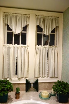
The old embroidered cafe curtains were country, not cool.


I replaced them with sleek Roman shades. 
(Drapes made by Pat Martin of Going Home Interiors.)
Now we step, instead of onto the needlepoint Victorian runner,

 onto a contemporary dhurrie rug. 

I love how the fleur-de-lis rug pattern acknowledges the Napoleonic motif on top of the mirrors.

 Finally, I splurged on a lighted makeup mirror (since I am not getting any younger myself)...
 and a new shower head for my husband.

Actually, the master-bath face lift didn't break the bank. We kept our flooring and countertops and  didn't move or replace any plumbing fixtures. Yet, I think you'd agree, she looks years younger!